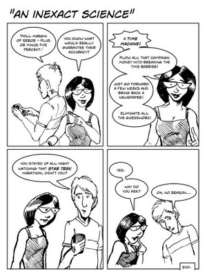
So, having had a script idea approved, the time had now come to illustrate the damn thing. I usually like to do as much prep work as possible in the sketch phase, since visual storytelling has always been my handicap - a major stumbling block for a cartoonist! - and there's nothing like doing a fully inked page only to discover that some major point of the damn thing is unclear.
Of course, with each successive submission I did for these strips, I did less and less drawing. Partly that was for time reasons - the more time I spend on the strip means the less I'm getting paid for my time, if that makes any sense. Partly, there was a nagging idea at the back of my head that some of the more involved drawing from the earlier submissions was distracting the client from the strip, if that makes any sense.
So the strip they ended up accepting had nothing more than the characters standing in a void, only marginally interacting. Well, that's no good. Time to do some staging. Out of all the settings that I'd already used, the coffee shop locale seemed the most likely candidate for this strip - although I really want to do a strip outside, set on the campus quad, so I can render some damn trees and Greek Revival architecture. Maybe next time.
So I stole the staging from myself from the coffee shop strip, and proceeded to pencil from scratch. My preferred work method these days is to work up a full layout sketch, print it out at the size of the final (usually tiling it in Acrobat), and then taping it to the back of a clean sheet of bristol and tracing a basic layout in Non-Repro Blue over a light box. However, there was nothing salvageable drawing-wise from the comp, so nothing for it but to draw it again, from scratch, only better.
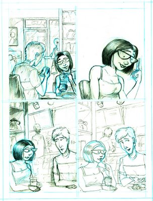
Again, I use the Non-Repro Blue to do the basic forms and placement, then do all the pencil rendering in graphite. The point of this is that a lot of corrections will be made at the layout stage, but, generally, by the time you start rendering, the basic drawing will be 'correct.' Blue pencil means I don't have to erase during the layout stage, and lots and lots of erasing can really mess up the page. It also means that I avoid laying the graphite down too heavily, which can then make it impossible to erase after the inking.
The technical problem that this strip posed was that the layout had me crossing the Director's Line. At least, I believe that's what it's called when you have two characters speaking and then flip the camera around them for an edit within the same scene. As you can imagine, on film, it's really disorienting, and it's something you should try to avoid in visual storytelling of all stripes.
However, I also set myself up the problem of having the characters reverse the order of their speech after the first panel, and I hate having the second character in the panel speak first. Nothing for it but to do a cutaway (the second panel) and hope that people aren't too distracted by the swap. I also made the background 'pan' so that it would be clear - hopefully! - that we're now looking at them from an opposite angle, and it's not that a third person is seated at the table.
The pencil stage was submitted and approved, so I moved on - first to lettering, then to inking. My preferred ink tool for the last decade or so has been the brush (Windsor Newton 00 or whatever else is handy), but, as mentioned, the Art Director likes my fussy pen and ink work, so I try to include some of that in these strips. The previous strip I did was done all in brush, and I thought the backgrounds came out too heavy, so this time out, I split the difference and inked the foreground characters with the brush and did all the backgrounds - including the background characters - with the Hunt 102 pen.
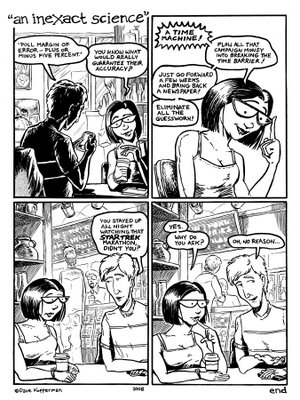
I normally wouldn't do all that rendering for a page that's going to be in color, but, again, pleasing the art director is at the forefront of my mind with these. The hand lettering is one the A.D. and I are in complete agreement on - we both prefer it to computer lettering.
Note the completely gratuitous use of the mechanical tone - Letratone Mezzotint 20% screen, to be exact - over the jacket in the first panel. Despite the fact that I view original comic art just as a stage in the production process, the use of this stuff clearly shows that I have at least some interest in the final inked page as an object in its own right. A total affectation on my part, and one I probably won't give up - at least on small, single pages like this. If I ever get around to doing long form comics, again, I may have to abandon it as time-consuming and expensive, two factors that will no doubt overwhelm any need to be cutesy on my part.
When I color, I like to work from a ground - a technique I learned not from my four years at art school, but from an aside in a Ed Sorel interview in The Comics Journal. The ground gives me both a unifying color scheme and a way to make the other colors 'pop' more. So I like it, and I probably owe Mr. Sorel a percent of my college tuition.
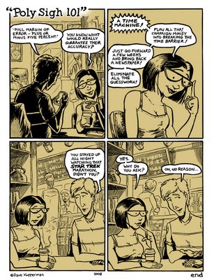
Colored in Photoshop, of course.
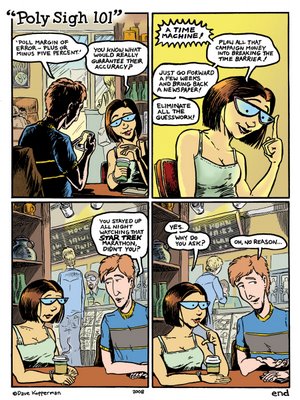
Note the title change in the final color version - they were afraid that people might not get that it's an election poll that's being discussed. Despite the fact that it's made pretty explicit in the second panel, when she talks about 'campaign money.' The new title is their proposal. I counter-proposed 'Political Science,' which I think is much more on point - the pun in their title seemed to obscure the issue further, really - but they liked theirs, so theirs it be.
D.
6 comments:
fucking cool...
I realized after I posted all this that you have something almost identical - even more specific, in fact - posted over at your site.
Each one of these pages has been done in a totally different way - the first was watercolor! - but I think this is the method and look I'll be sticking with in the future.
D.
Yeah, but yours has the added layer of coming up with the concept by committee, with a client...
WOuld be really cool to have this as an item on Walrus comix, but I dunno if you want to talk about the company on a more public forum...
True, the work-for-hire aspect and my Koppersonian ways of dealing with it make for interesting, low key 'adventures.' Tintin in the Bureaucracy, minus the snakes and the questionable racial caricatures.
I do own the copyright on them, so I think I can reproduce them anywhere I want - although I would wait until after the issue each strip appears in to reproduce them in a wider forum (I doubt there's any crossover between the magazine and the Subway Rambler's fives of readers).
The problem is, I'm not convinced that the results are 'good' comics. Which is sort of the whole point. I mean, I think the drawing is good, but the writing is less than deathless, for the reasons mentioned in yesterday's entry. Although I'm pretty pleased with the economy and rhythm of the language under the constraints.
The style of humor on display here is so far removed from the aesthetic of other comics on W.C. that I'm afraid people would miss the point of how and why they were created, and would instead wonder, 'why are they putting up such half-assed comics?'
Good looking half-assed comics, but missing a cheek nonetheless.
You can see my point - they're decent portfolio pieces, but I don't think they represent what I really do, and I don't want people dismissing other work I do based on having read these.
D.
I beg to differ... the art itse;f is really great, and how you write about the compromise illustrates in an effective and enterraining fashion what it's like to be a professional illustrator.. I think highlighting it would show a different persppective not at all commonly shown...
It;s up to you of course..
Well, let me think about it. Again, I wouldn't post in a wider forum until after the magazine where the strip is running goes to press, so that gives me a good couple of months thinkin' time.
D.
Post a Comment