"To this day, I cannot comprehend why you got so demoralized and gave up on ATEOTWWMS. The first issue was quite good and the second issue was looking a lot better, in terms of the story picking up some steam."
Well, clearly the reason I gave it up is that as an acronym, it totally blows. Where's the elegance of "ST:TNG" or "WTF?" I'd taken to shortening it to just "Sister," but to my lights, all great works of sci-fi have to be able to have that great acronym.
Anyway, the reasons are manifold (clunky storytelling, unclear direction, more than I could chew, self-doubt, rickets), but only one really matters (psyched myself out). Here's most of the prologue. I'll let it go mostly without comment, except to note that the drawing quality varies wildly, from quite nice to pretty amateurish; the title lettering was done by hand - mostly copied out of my Letraset catalogue because I couldn't afford the real stuff and I actually enjoyed doing that kind of shit, and I have to confess that the wormhole on the first page is probably inspired most directly by the film version of Howard the Duck.
Also: the reason the panel borders are all bendy is not by some aesthetic choice, but because I used border tape that has, in the 14 years since it was affixed to the page, shrunk and warped. Those used to be nice straight lines. That was the point of the border tape in the first place. Ditto the mechanical tones (not Zip-a-Tone, which I hated and was either going or gone out of business by that point, anyway, but LetraTone), which is why there are halos around all the mechanical tones. Shame, because I was really anal about laying that stuff in just right.
Remember to click for bigness, and apologies for the two page spreads, which will require some horizontal scrolling!
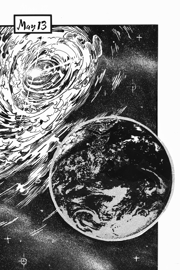
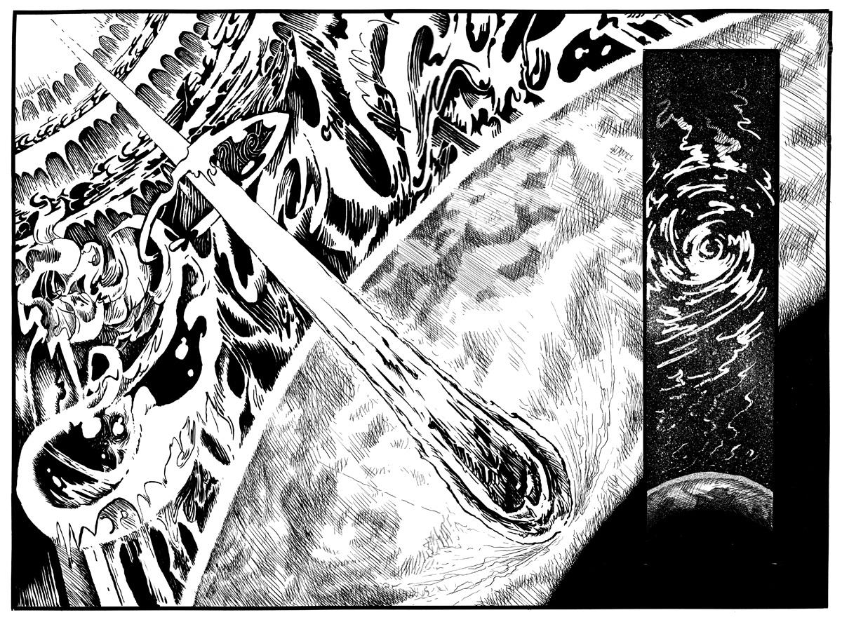
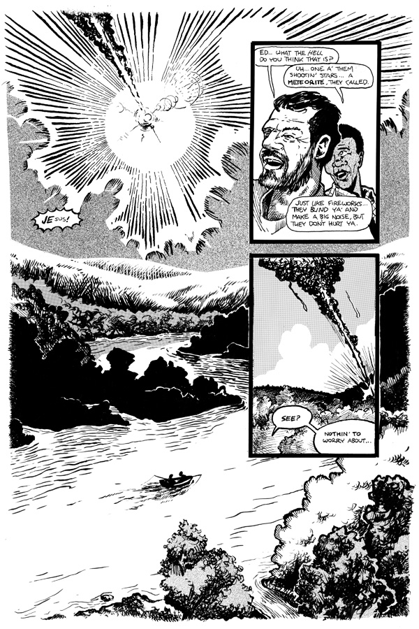
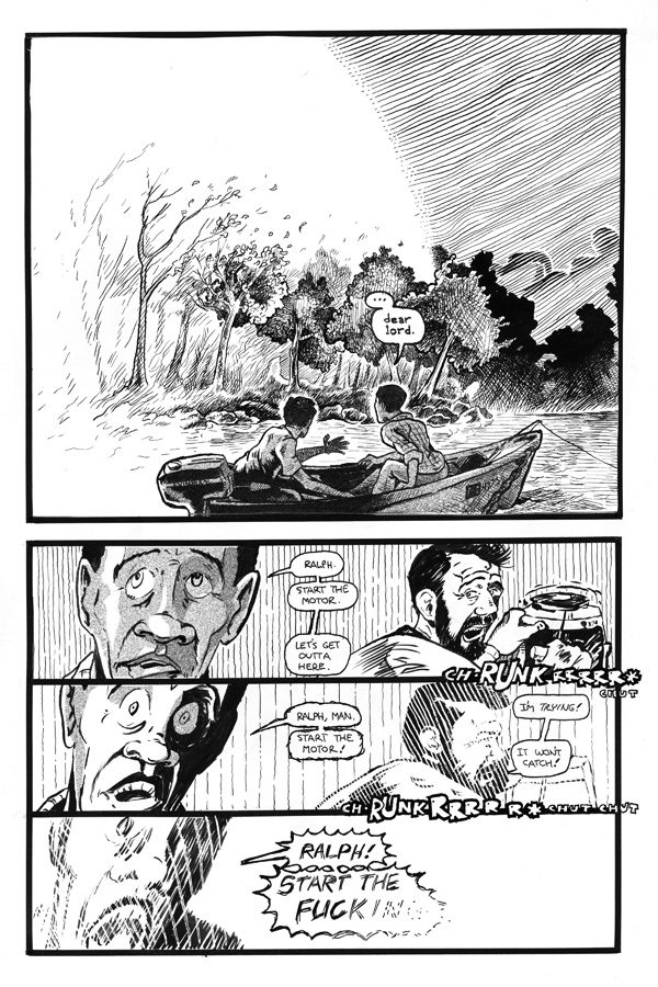
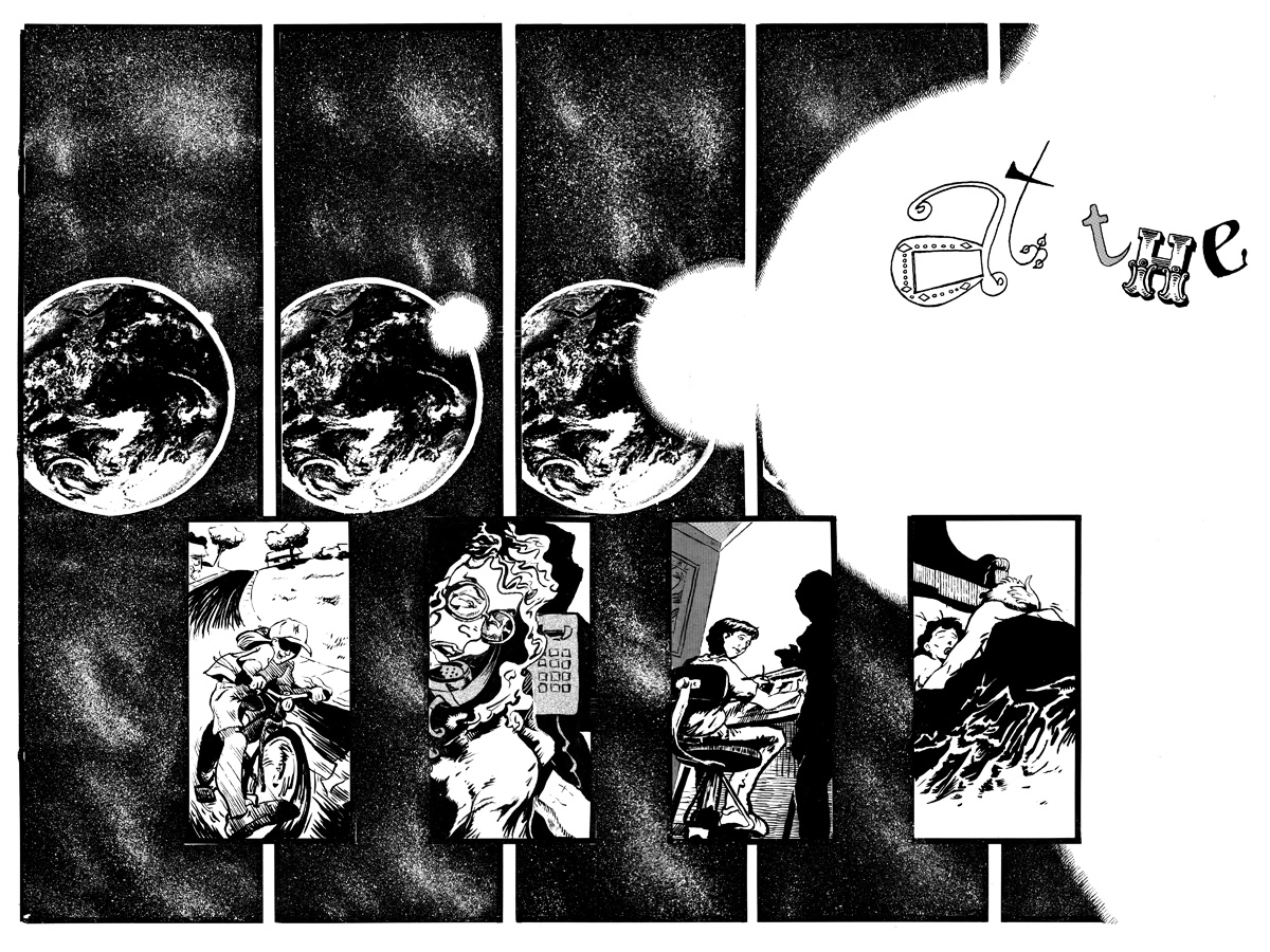
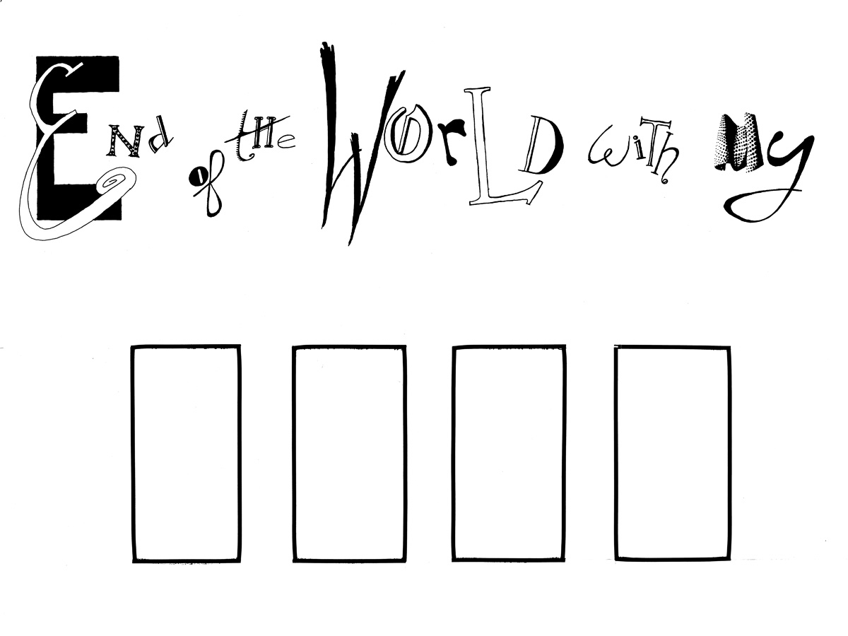
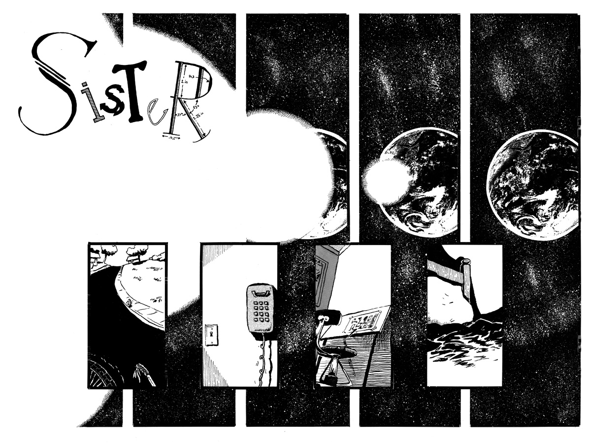
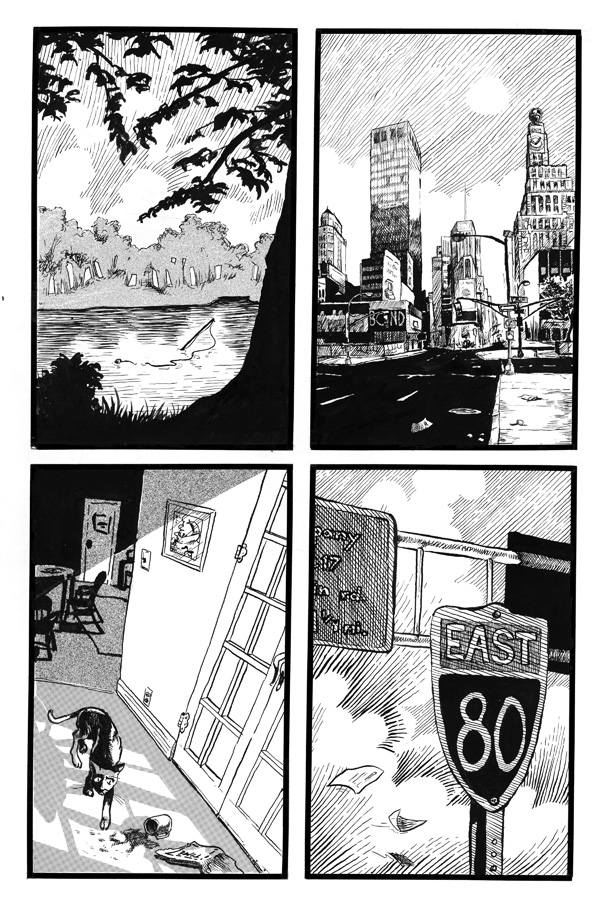
Next: What the hell was all that about?
D.
3 comments:
These pages look really good. Better than I remembered. I'll say it again: This art is superior to 85-90% of the crap filling up the shelves at Forbidden Planet. The writing, too (I'll assume the Jordy Verrill meteorite dialogue was intended in a fun, B-movie way; anyway I liked it). I think you should pick up right where you left off, not redraw anything (the art is really strong and polished, unlike Scaredy Cat), and maybe try paring the story down to it's bare essentials (132 pages, or somethin'?).
seeing as how i'm the sister in question here, i'm compelled to comment.
i've always been sad you left this off. i've always wondered what would happen next, and sometimes take out and re-read my copy.
but, how you ever even got as much done as you did is a mystery. all that inking. that is some serious work.
if you take john's suggestion and start up with this again, will the world have ended while we were in our early 20s, or will we suddenly have morphed into the middle-aged homeowners we are today?
John: Your advice is good (although I'd disagree with your negative assessment of Scaredy Cat, where I thought the art was excellent), but a point of "Sister" wasn't the story (although that was good, I thought), but the realization of the accumulated anxieties of the central character, coupled with my thoughts on contemporary America. Circa 1994, of course. If I cut it down too much, the a lot of what I liked about it would have to be cut. Sadly, Sister either has to be 600 pages or none at all.
Also: yeah, the dialogue, to put it bluntly, sucked. More on that in this new blog.
Leah:
Since the story was about the characters - who we were then - I think it would have to take place 'back in the day.' And I like the fact that enough time has passed that a story set in the mid-1990's would be a period piece...
Post a Comment